Bringing Data to Life!
We’re proud to bring you another release jam-packed with helpful updates to Pendulum. We’ve been working on some clever algorithms to fetch key information – bringing data to life in our new homepage and analysis dashboards.
Dazzling Dashboard 🤩
Next time you log into Pendulum, you’ll notice things are a little bit different on your homepage, we have some beautifully designed widgets so you can keep on top of, and manage, the states of all your visits…
Got a visit next week you need to plan for? We’ll let you know.
Juggling lots of visits? We’ll help you stay on top of project managing them.
Not sure if you sent a report to school? It’s recorded in the submitted section.
As long as they’re scheduled, we’ll flag ‘upcoming visits’ for you to keep on top of what’s coming up. We’ll also remind you of where you’ve just been in ‘recent visits’, so you know exactly what you need to action. We’ve even colour coded these to match the visit states so anything in draft format will have an orange label against the school, grouped together with all other draft visit reports on the right-hand side – organisation at its best.
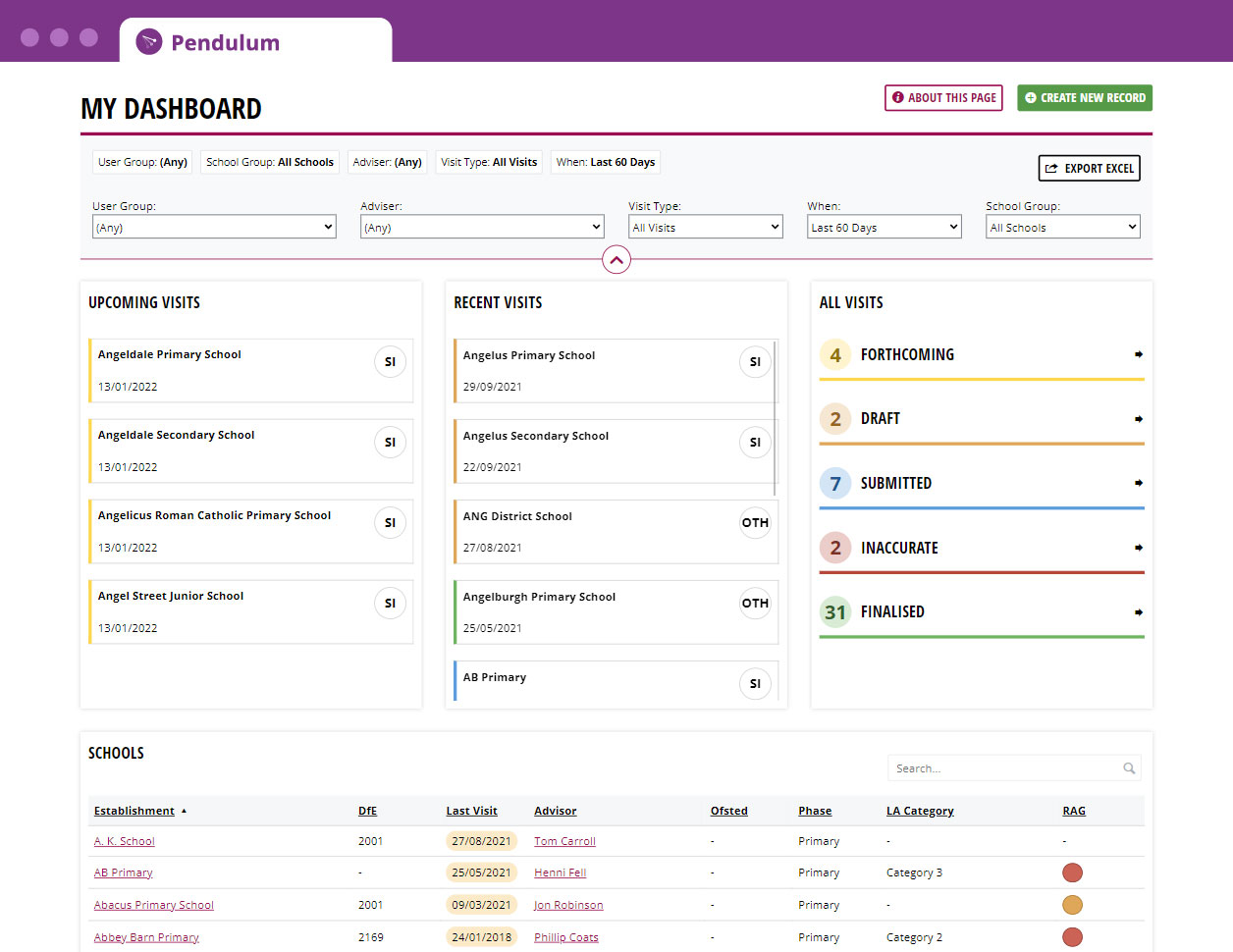
As part of these enhancements, you can now find a quick, searchable schools directory too. This means you don’t need to leave the Pendulum homepage to look up a school anymore – plus we will soon be adding some “quick actions” to make it even easier to complete those everyday tasks.
Don’t worry, for those of you who love the Portfolio page, we haven’t taken it away, it’s still in the toolbar at the top 😉
Bringing Data to Life 🤗
We promised you a new, snazzy, workload-reducing, time-saving, frustration-free, data-driven analysis dashboard, and guess what, we’ve delivered yet again.
Say goodbye to downloading raw data and picking out key themes by yourself – our analysis dashboard will do all the hard work for you by identifying those common patterns, such as schools with the most visits or schools with no visits, all presented beautifully for you to process.

Pendulum lets you focus on 3 areas, visits, schools and advisors – you can see in the new tabs that each area will draw your attention to key aspects that may need your attention…
- Visits for example will focus on overdue visits, blank/unfilled visit reports and more.
- Schools will show who hasn’t had a recent visit, or which ones have had the most.
- Advisors (only available to Visit and Super Admins) can highlight who’s completed the most visits or those with the most admin time – helping you provide any support that may be needed.
These tabs can really revolutionise the way you work, they’ve all been updated based on your feedback – they’ll enable you to focus on areas you may want to do some investigation or follow-up work as well as proactively sharing intelligence when you login.
We think you’re going to love them./
Coming Soon 👀
As well as keeping track of all your visits on the homepage, soon we will also be bringing all your Actions together into the homepage so you can manage all your Actions across all your schools in one place.